Hello there, it's Dave Fox! I'm an iOS engineer from the Creation Development department in Cookpad. (@wowitzdave)
In this post, I'm going to talk a bit about how I used custom internal tooling and prototyping tools to help Cookpad's design and development workflow.
I'll look at how product and engineering teams can interact with each other more efficiently and ways in which we, as engineers, can empower designers to make their visions become a reality more easily.
Introduction
Last year, I began work on the internal Cookpad iOS renewal project. As part of its development, I was responsible for creating a new UI component to display user images in a style known as the Ken Burns effect.
The effect consists of panning and zooming around images and cross-fading between each one to give a sense of depth and dynamism.
Here's a short look at it in the iOS Cookpad app today...
Technical Implementation
Looking at the above effect, it doesn't seem too complex to implement... Just display some images with a zoom or a pan and fade between them. However, there are many settings and attributes applied to each image's animations and also to the slideshow's root animation as a whole. Each and every one of these values needs to be carefully considered to create the right "feel". Let's take a look at the parameters our animation requires:
For The Overall Slideshow
How long (in seconds) should we show each image?
How long (in seconds) should the duration of the cross fade be?
Additionally, each image uses either a zoom or a panning animation. These styles also have individual settings...
For Panning Images
From which anchor points should the animation start from and end at?
What speed should the animation happen at?
For Zooming Images
At which anchor point in the image should we zoom from?
What scale should we zoom from and to?
What speed should the animation happen at?
In order to create the exact effect the product team wants, these are all parameters the designers want to be able to define.
In a feature like this, it is often difficult for designers to imagine exactly what values they want. Often, design and development will work on a "trial and error" basis, tweaking values back and forth. With this many settings though, it would take a lot of time from two people to achieve the final goal. The workflow may look something like this:
The issue with this flow is the "Cross-department communication" bottleneck. Because of rapid iteration, this happens frequently and takes the time of both engineering and design teams to communicate changes. Each iteration takes a lot of time and disturbs the working pattern of all members involved on a feature.
A Product-Centric and Tools-Driven Approach
I had a lot of other tasks to work on as part of the renewal project but I knew the product team would want to iterate on this feature a lot so I decided I wanted to create a workflow which could reduce friction between design and engineering, keep both sides as productive as possible and, at the same time, create a toolset that is easy to use and familiar to designers. This was important to enable design to be as creative as possible.
Giving Designers Greater Control
To achieve this workflow, I decided to make a testbed application that would allow the design team to reiterate and play with all these animation values.
Then, when they were satisfied with the final animation. I could simply take their finalised values and copy them into the main iOS app codebase.
This would make the following workflow possible:
Designers perform both the review and adjustment stages
Testbed Application Implementation
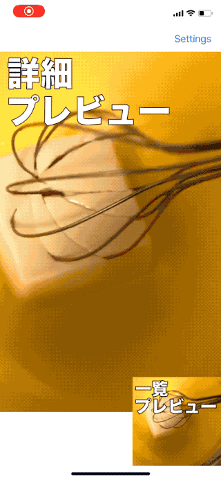
So, I started off with a basic implementation of the Ken Burns effect with some default values and then created a simple application with screens to alter the animation settings and view a live preview of how the animation would look in the final product.
Let’s take a look at what this app ended up looking like:
Overall Settings
Zoom Settings
Pan Settings
Overall animation settings
Zoom scale and anchor point settings
Pan from and to anchor point settings
As the design team modifies the animation values, they can preview their settings at any time on the home screen. This screen shows the animation in a number of different sizes and aspect ratios so the designers can see how things will look in a variety of different contexts within the Cookpad iOS application:
The designers can quickly and easily play with these values and, once happy, I have one sit-down meeting with them and integrate their final values into the application.
Results
When I think of the merits of this kind of approach to feature development, I look at two main areas:
Engineering time and effort
Friction between the wants of designers and the final output of engineering.
Time Taken
The design team made many many iterations of these values within the testbed application but because they could iterate in isolation, I didn’t need to spend any of my time on each change. With the "one time integration" approach, bringing the product team's vision into the main app only took me about 15 minutes of my time.
To this end, the amount of time taken from creating the prototype application and finalising the settings within the app was quite short so I think it was definitely worth it to take this approach.
Interaction With Designers
I had good feedback from the design department. Designers work visually and want to tweak settings and values on-the-fly. Giving them a visual interface to perfect this feature is more in tune with how those departments work so I think they found this approach more natural and efficient. It also allowed them to use their creativity to the fullest as there was no engineering bottleneck in the way.
Thanks for Reading!
Have you used tooling like this before? Was it helpful and how did it help you integrate with your design and product teams?
I believe that engineers shouldn't just code. They should also engage in the product development lifecycle. I think that understanding what product teams want and helping them realise their visions makes us better engineers and helps us grow as contributors across the entirety of a project, not just its codebase.
To that end, custom tooling like this can help bring us closer to the product team and helps them realise their visions more easily, often resulting in better, more cohesive products.
Thanks again for checking this post out. I hope it helps you and your team make better products going forward...
Costco が扱っているデータのほとんどは Cost Explorer API から取得したデータそのものや、それらを加工したものです。API のコールには 1 リクエストあたり 0.01USD と、積み重なるとそれなりに高額になりうる料金がかかるため、バッチ処理で定期的に Costco に取り込むようにしています。
予算と月次のふりかえりに関する機能
予算を Cost Explorer のフィルタとして定義する
Costco には予算という概念があります。これは組織としての予算に対して Cost Explorer のフィルタを紐付けるものです。ここで設定した Cost Explorer のフィルタは「ある予算が何を意味しているのか」をコード (JSON) として直接説明しています。ここに日本語のような曖昧さは発生しません。さらに良いことに、このフィルタは実際に動きます。フィルタを使って Cost Explorer で簡単にコストを可視化できるのです。
クックパッドでは、従来 EC2 について RI を購入していましたが、 RI の維持管理を楽にするために既存の RI が切れ次第、Savings Plans (Compute) に置き換えを進めています。Savings Plans (Compute) では、一定のルールにしたがってリザーブが自動的に適用されるため、結果的にどのリージョンにどの程度 Savings Plans が適用されたかは Cost Explorer API から取得したデータを使って自前で計算する必要があります。
クックパッドの DWH チームの尽力により CUR が Redshift Spectrum で簡単にクエリできるように整備されており、社内の Tableau を利用することで CUR のデータをベースにしたダッシュボードを作れるようになっています。ただし、CUR のデータは良くも悪くも「生」なデータで、非常に多くのカラムがあり、それらを正しく組み合わせてダッシュボードを作ることは、まさに Tableau 職人の技といえるでしょう。
わたしは残念ながらその域には達していないことと、Route 53 のドメイン請求一覧の機能などは Tableau では実現できないため、Costco のようなウェブアプリケーションの形にしました。その他にも、CUR だけでは Cost Explorer API で取得できるようなコストの予測値は得られませんし、Cost Explorer API では簡単に得られる償却コストの計算も難しいです。
ただし、今後 Cost Explorer API では得られないような情報を Costco で扱いたくなった場合には、CUR のデータをもとに Redshift で集計して Costco に取り込む、というニーズが発生するかもしれません。また、Costco 上でグラフィカルに表示することが難しい場合に Tableau ダッシュボードにリンクするなど、うまく活用していく道があるかどうかは常に考えています。
ともすれば、Costco のようなアプリケーションを開発することは、組織の規模感や状況によってはオーバーエンジニアリングとなるかもしれません。しかしながら、その根底にある考え方はあらゆる組織で役立つものだと信じています。たとえば、コスト配分タグの管理を Google スプレッドシートなどのツールで小さく始めてみるのも良いかもしれません。
// This project is licensed under the MIT license.// // Copyright (c) 2020 Cookpad Inc.// // Permission is hereby granted, free of charge, to any person obtaining a copy// of this software and associated documentation files (the "Software"), to deal// in the Software without restriction, including without limitation the rights// to use, copy, modify, merge, publish, distribute, sublicense, and/or sell// copies of the Software, and to permit persons to whom the Software is// furnished to do so, subject to the following conditions:// // The above copyright notice and this permission notice shall be included in// all copies or substantial portions of the Software.// // THE SOFTWARE IS PROVIDED "AS IS", WITHOUT WARRANTY OF ANY KIND, EXPRESS OR// IMPLIED, INCLUDING BUT NOT LIMITED TO THE WARRANTIES OF MERCHANTABILITY,// FITNESS FOR A PARTICULAR PURPOSE AND NONINFRINGEMENT. IN NO EVENT SHALL THE// AUTHORS OR COPYRIGHT HOLDERS BE LIABLE FOR ANY CLAIM, DAMAGES OR OTHER// LIABILITY, WHETHER IN AN ACTION OF CONTRACT, TORT OR OTHERWISE, ARISING FROM,// OUT OF OR IN CONNECTION WITH THE SOFTWARE OR THE USE OR OTHER DEALINGS IN// THE SOFTWARE.publicfinalclassMyCustomButton:UIControl {
privatestaticletcornerRadius:CGFloat=4privatelettitleLabel= UILabel()
privateletsubtitleLabel= UILabel()
privatestaticletinsets= NSDirectionalEdgeInsets(
top:5,
leading:5,
bottom:5,
trailing:5
)
privatefuncsetUp() {
// ユーザーの文字サイズの設定によってサイズの変わるフォントを使う// `UIFont.preferredFont(forTextStyle:)`の代わりに`UIFontMetrics.default.scaledFont(for:)`を使っても良いです
titleLabel.font = UIFont.preferredFont(forTextStyle: .headline)
titleLabel.adjustsFontForContentSizeCategory =true
subtitleLabel.font = UIFont.preferredFont(forTextStyle: .subheadline)
subtitleLabel.adjustsFontForContentSizeCategory =true
titleLabel.numberOfLines =0// 行数制限なし
titleLabel.textAlignment = .center
subtitleLabel.numberOfLines =0// 行数制限なし
subtitleLabel.textAlignment = .center
letverticalStackView= UIStackView()
verticalStackView.axis = .vertical
verticalStackView.alignment = .center
verticalStackView.isUserInteractionEnabled =false// タッチイベントはこのボタンまで来てほしい
verticalStackView.translatesAutoresizingMaskIntoConstraints =false
addSubview(verticalStackView)
// 左右上下の制約にinsetsの値を活用しても良いのですが、今回はUIStackView.directionalLayoutMarginsを使ってみました
verticalStackView.topAnchor.constraint(equalTo:topAnchor).isActive =true
verticalStackView.bottomAnchor.constraint(equalTo:bottomAnchor).isActive =true
verticalStackView.leadingAnchor.constraint(equalTo:leadingAnchor).isActive =true
verticalStackView.trailingAnchor.constraint(equalTo:trailingAnchor).isActive =true// stack view内に余白を少し入れておきます
verticalStackView.isLayoutMarginsRelativeArrangement =true
verticalStackView.directionalLayoutMargins =Self.insets
verticalStackView.addArrangedSubview(titleLabel)
verticalStackView.addArrangedSubview(subtitleLabel)
// stack viewのおかげで隠れたビューがスペースをとりません
subtitleLabel.isHidden =true
layer.cornerRadius =Self.cornerRadius
clipsToBounds =true
updateColors()
updateAccessibility()
}
privateenumDisplayState {
case disabled
case enabled
case enabledHighlighted
}
privatevardisplayState:DisplayState {
if isEnabled {
if isHighlighted {
return .enabledHighlighted
} else {
return .enabled
}
} else {
return .disabled
}
}
privatefuncupdateColors() {
lettextColor:UIColorletbackgroundColor:UIColorswitch displayState {
case .disabled:
textColor = .white
backgroundColor = .lightGray
case .enabled:
textColor = .white
backgroundColor = .orange
case .enabledHighlighted:
textColor = UIColor.white.darkened
backgroundColor = UIColor.orange.darkened
}
self.backgroundColor = backgroundColor
titleLabel.textColor = textColor
subtitleLabel.textColor = textColor
}
publicoverridevarisHighlighted:Bool {
didSet {
updateColors()
}
}
publicoverridevarisEnabled:Bool {
didSet {
updateColors()
updateAccessibility()
}
}
publicoverrideinit(frame:CGRect) {
super.init(frame:frame)
setUp()
}
publicrequiredinit?(coder:NSCoder) {
super.init(coder:coder)
setUp()
}
publicvartitle:String {
get {
titleLabel.text ??""
}
set {
titleLabel.text = newValue
updateAccessibility()
}
}
publicvarsubtitle:String {
get {
subtitleLabel.text ??""
}
set {
subtitleLabel.text = newValue
subtitleLabel.isHidden = newValue.isEmpty
updateAccessibility()
}
}
privatefuncupdateAccessibility() {
isAccessibilityElement =truevaraccessibilityTraits:UIAccessibilityTraits= .button
if!isEnabled {
    accessibilityTraits.insert(.notEnabled)
}
self.accessibilityTraits = accessibilityTraits
accessibilityLabel = [title, subtitle].filter { !$0.isEmpty }.joined(separator:"\n")
}
}
TrivyとAWSの各種マネージメントサービスを利用し、コンテナイメージの脆弱性スキャンパイプラインを構築しました。AWSのサービスと接続することから、基本的な制御の部分にはLambdaを利用し、サーバレスなアーキテクチャになっています。デプロイにはAWS CDK(Cloud Development Kit)を利用しています。
options:- name: sceneName
    question: Sandbox scene name?
    description: new Sandbox scene name to generate. (e.g. RecipeDetails).
    type: string
    required:true- name: moduleName
    question: Destination target?
    description: module name to generate new sandbox scene for. (e.g. RecipeDetails)
    type: string
    required:truefiles:- template: AppDelegate.swift.stencil
    path:"{{ moduleName }}AppDelegate.swift"
$ ./scripts/generate-sandbox
[14:00:14]: Welcome to Sandbox Scene generator
[14:00:14]: What target do you want to make sandbox for1. MyFeature
2. MyAwesomeFeature
?  1[14:00:22]: Enter new Sandbox Scene name to generate. Upper camel case is recommended. (like RecipeDetails)
MyFeatureDetail
[14:00:40]: Generating MyFeature/MyFeatureDetail
[14:00:40]: $ /path/to/ios-cookpad/scripts/mint run Genesis genesis generate /path/to/ios-cookpad/templates/SandboxScene.yml --destination /path/to/ios-cookpad --option-path /var/folders/p7/g0t6l0zx00sbdxxrnm7wq8d80000gp/T/options20200714-98239-1lwms1g.yml
[14:00:40]: ▸ Generated files:
[14:00:40]: ▸   Sandbox/MyFeature/MyFeatureDetailSandboxScene.swift
[14:00:40]: ▸   Sandbox/MyFeature/AppDelegate.swift
$ gem-codesearch "^class Set$"
/srv/gems/ConstraintSolver-0.1/lib/extensions.rb:class Set
/srv/gems/GoNodes-0.0.1/lib/monkeypatch/set.rb:class Set
/srv/gems/Narnach-minitest-0.3.3/lib/set_ext.rb:class Set
/srv/gems/Ron-0.1.2/lib/ron.rb:class Set
/srv/gems/acapela-0.8.1/script/create_voices.rb:class Set
/srv/gems/annlat-0.0.1/lib/annlat/LaRuby.rb:class Set
/srv/gems/antlr4-0.9.2/lib/antlr4/base.rb:class Set
...
というわけで、本記事では Cookpad Pad 2 を例に取りながら、自作キーボードキットを作成する方法について解説します。キーボードの開発はさまざまなノウハウが公開されているため、実際のところそれほど難しくはありません。本記事ではキーボード開発についての完全な手順を説明するというよりも、有益な記事やリソースを紹介することで、全体の流れとして個々のノウハウを結びつけることを目指します。
まず、最初に行なうのは、どのようなキーボードをつくるのか構想することです。Cookpad Pad 2 は 6 キーのマクロパッドです。デフォルトでは「C」「O」「K」「P」「A」「D」の 6 文字が打てるので、「cookpad」と打つときに便利なキーボードです。初代のモデルは、2019年頃に製作をして、ノベルティとして個人的に配布をしていました。
デザインは、この初代 Cookpad Pad を踏襲するものとします。 6 キーを格子状に配置したシンプルなデザインです。また、ケースは PCB を 2 枚のプレートで挟み込んだ、サンドイッチマウント構造にします。この構造は自作キーボードでよく採用される構造で、安価に作成できることがメリットです。
それから、コネクターとして USB Type-C を採用します。そのために、 Pro Micro というマイコンボードを利用しない方針とします。 Pro Micro は自作キーボードに必要な電子部品が実装されているので、基板の設計を単純にすることができます。一方で、Micro USB Type-Bコネクタが採用されていたり、ピンヘッダでマイコンボードを取り付けるため、設計上の制約がでてしまうという欠点があります。そこで、 Pro Micro の利用をするのではなく、直接基板に同等の機能を実装していきます。
I'd like to order PCBA service. Could you give me a quotation for attached files? The shipping address is as follows. I would prefer OCS as a shipping method.
#define VENDOR_ID 0xFEED#define PRODUCT_ID 0x9009#define DEVICE_VER 0x0002#define MANUFACTURER Cookpad Inc.#define PRODUCT Cookpad Pad#define DESCRIPTION A six keys macro pad made by Cookpad.
config.h:31-45では、キーマトリクスの定義を行ないます。Cookapd Pad は 2行 × 3列 のマトリクスですので、そのように定義をします。さらに回路図を確認し、ピンとの対応も定義します。


 Overall animation settings
 Zoom scale and anchor point settings
 Pan from and to anchor point settings